
Happy Mother's Day. Big Sale Up to 40%
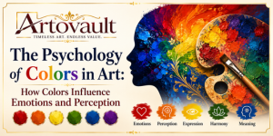
Artists throughout history have carefully selected colors to communicate feelings, tell stories, and influence the way people perceive their work.
The psychology of colors explores how different colors affect human emotions, behavior, and decision-making. While cultural interpretations of colors may vary, many emotional responses to color are remarkably universal. Understanding color psychology allows artists, designers, collectors, and art enthusiasts to appreciate the deeper meaning behind every masterpiece.
In this article, we explore the significance of colors in art, their psychological effects, and how artists use them to create powerful visual experiences.
Color psychology is the study of how colors influence human emotions, thoughts, and behavior. In art, colors are more than decorative elements—they are a visual language that communicates mood, symbolism, and atmosphere.
Artists use color to:
The strategic use of color can transform a simple painting into an unforgettable emotional experience.
Every color carries its own emotional energy. The same landscape painted in cool blues conveys serenity, while warm reds and oranges can make it feel dramatic and energetic.
Colors influence how viewers:
Great artists understand that color often speaks louder than words.
Red is one of the most emotionally intense colors.
It often symbolizes:
Artists frequently use red to draw immediate attention or create dramatic impact. It can make a composition feel energetic and emotionally charged.
Blue is associated with calmness and emotional balance.
It represents:
Blue is widely used in landscapes, seascapes, and religious art to create a tranquil atmosphere.
Yellow reflects warmth and positivity.
It symbolizes:
Bright yellow attracts attention quickly and can make artwork feel vibrant and cheerful.
Green is strongly connected with life and growth.
Its meanings include:
Landscape artists often use green to express vitality and peace.
Orange combines the energy of red with the optimism of yellow.
It often represents:
Orange adds excitement without the intensity of red.
Purple has long been associated with royalty and mystery.
It symbolizes:
Artists often use purple to create a sense of elegance and contemplation.
White conveys clarity and openness.
It represents:
In minimalist art, white space is often as important as the painted elements.
Black is a powerful color that can evoke strong emotions.
It symbolizes:
Used thoughtfully, black enhances contrast and creates dramatic visual effects.
Brown reflects the earth and natural materials.
It is associated with:
Many traditional artists use earthy tones to create realism and timeless appeal.
Pink often represents:
Soft pinks create calming and comforting visual experiences.
Warm colors include:
These colors generally evoke:
They tend to make objects appear closer to the viewer.
Cool colors include:
They often communicate:
Cool colors help create depth and spaciousness in paintings.
Although many emotional responses to color are widely shared, symbolism can differ across cultures.
For example:
Artists often consider these cultural contexts when creating works for diverse audiences.
Many renowned artists are celebrated for their distinctive use of color.
Vincent van Gogh used vibrant yellows and blues to express intense emotion and movement.
Claude Monet explored subtle color changes to capture light and atmosphere in his Impressionist paintings.
Mark Rothko employed large fields of color to evoke deep emotional and spiritual responses.
Pablo Picasso's famous Blue Period reflected themes of melancholy, while his later Rose Period conveyed warmth and optimism through softer palettes.
These artists demonstrate how color can become the defining voice of an artwork.
Professional artists consider several factors when selecting colors:
A carefully chosen color palette enhances both the visual appeal and emotional impact of a piece.
Contemporary artists often use bold and unconventional color combinations to:
In modern art, color itself often becomes the primary subject rather than merely supporting the composition.
Understanding color psychology helps collectors:
Whether decorating a home or investing in fine art, recognizing the emotional power of color adds depth to the collecting experience.
The psychology of colors reveals that every hue carries emotional, symbolic, and cultural significance. From the passionate intensity of red to the calming serenity of blue, colors shape how we perceive and connect with art.
Artists use color as a powerful storytelling tool, transforming ordinary canvases into emotionally resonant masterpieces. By understanding the meanings behind different colors, viewers can gain a deeper appreciation of artistic expression and the subtle messages hidden within every brushstroke.
Whether you are an artist, collector, or art enthusiast, exploring the psychology of colors opens the door to a richer and more meaningful experience of the visual arts.
Color psychology in art is the study of how colors influence emotions, perceptions, and interpretations of visual artwork.
Blue is widely associated with peace, calmness, trust, and emotional stability.
Warm colors create energy and excitement, while cool colors evoke calmness, depth, and relaxation. Artists use them to establish mood and visual balance.
Yes. While many emotional responses to colors are universal, cultural traditions can influence their symbolic meanings.
Understanding color psychology enhances appreciation of art, helps artists communicate effectively, and enables collectors and designers to choose artwork that evokes the desired emotional response.
Discover expert insights, collecting guides, conservation tips and inspiring stories from the fascinating world of fine art.














Jacky Chan
Since 2012
Lorem ipsum dolor sit amet consectetur adipisicing elit.
December 4, 2020 at 3:12 pm
ReplyAna Rosie
Since 2008
Lorem ipsum dolor sit amet consectetur adipisicing elit.
December 4, 2020 at 3:12 pm
ReplySteven Keny
Since 2010
Authentic and Beautiful, Love these way more than ever expected They are Great earphones
December 4, 2020 at 3:12 pm
Reply